“Products are made in a factory, but brands are created in the mind.”- Walter Landor
Evolving Supermarket Brand Identity Through Immersive Store Design: Trends and Campbell Rigg’s Approach
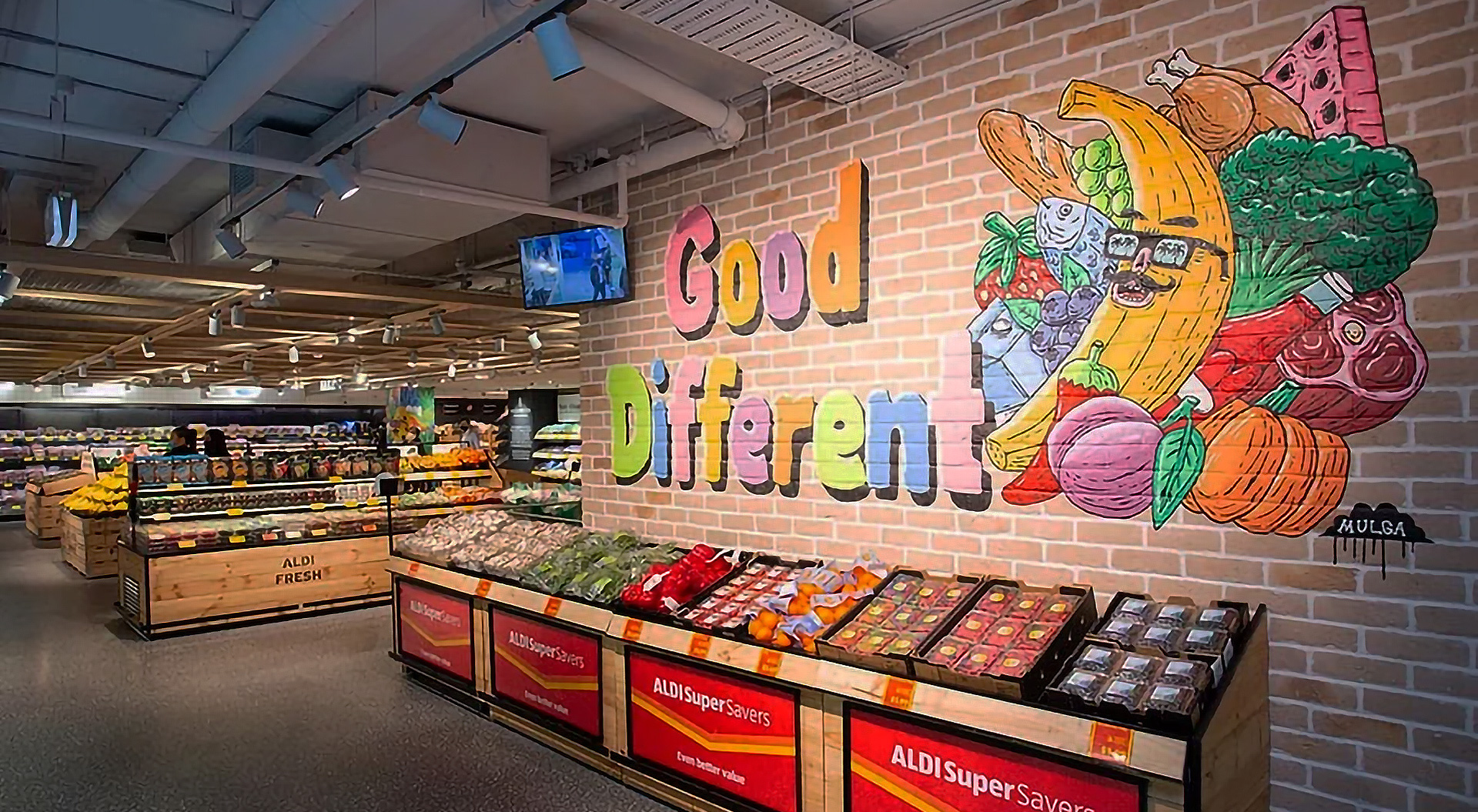
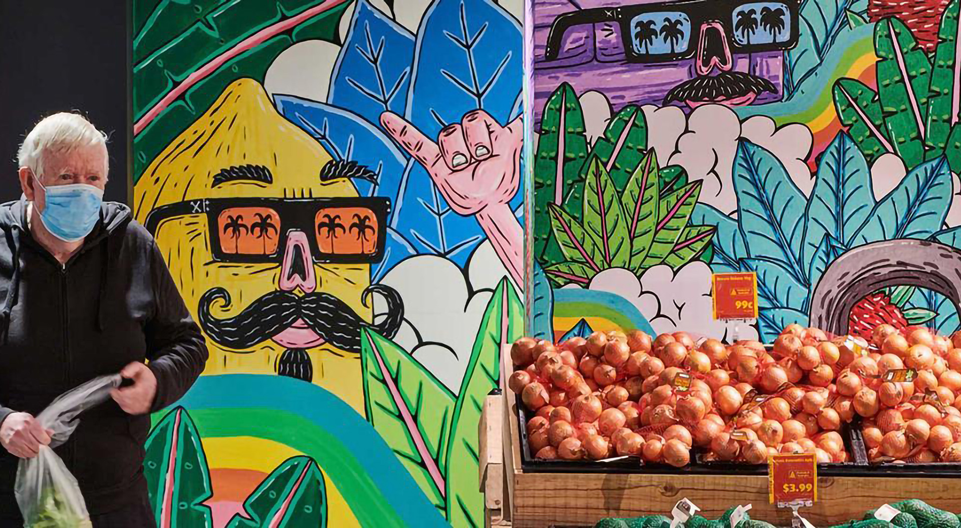
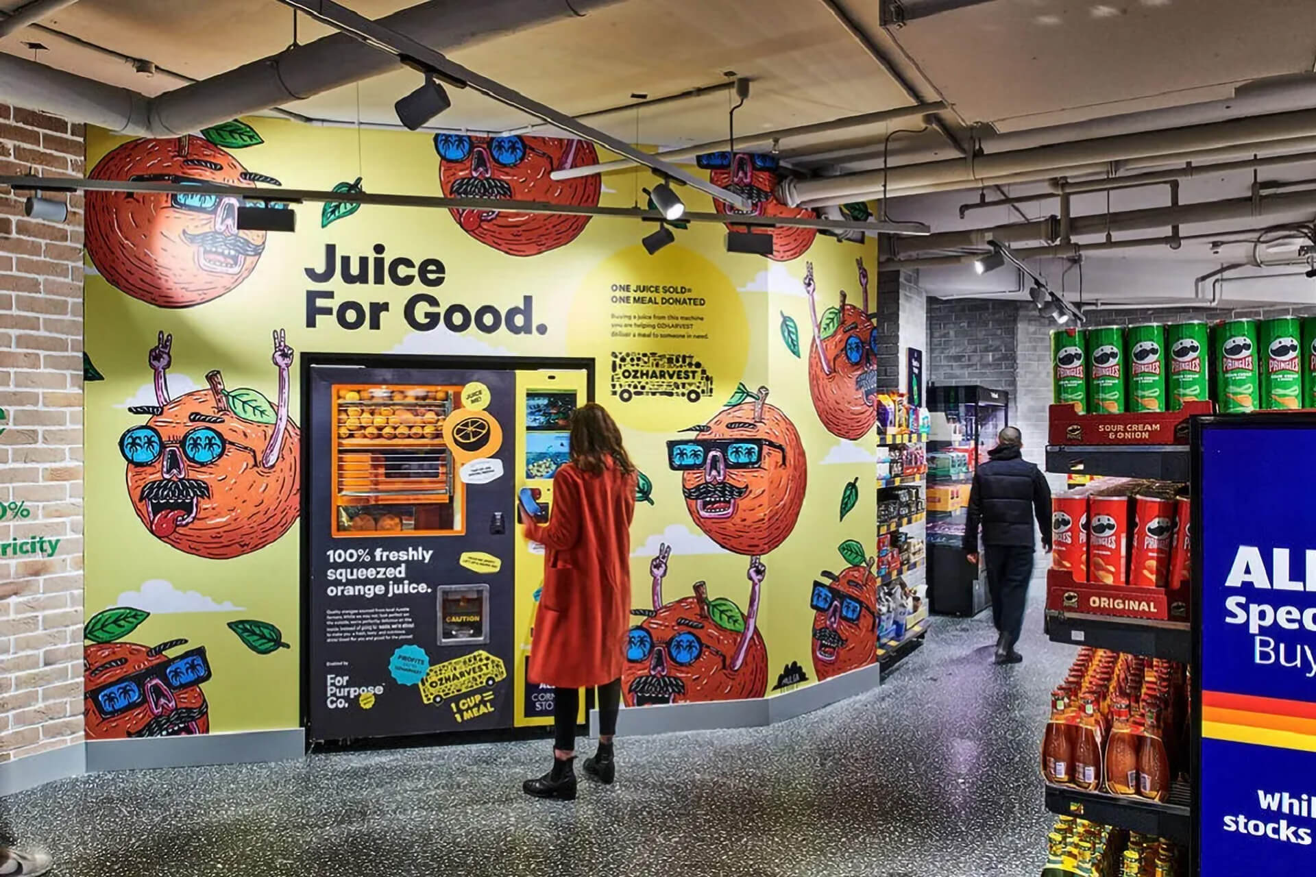
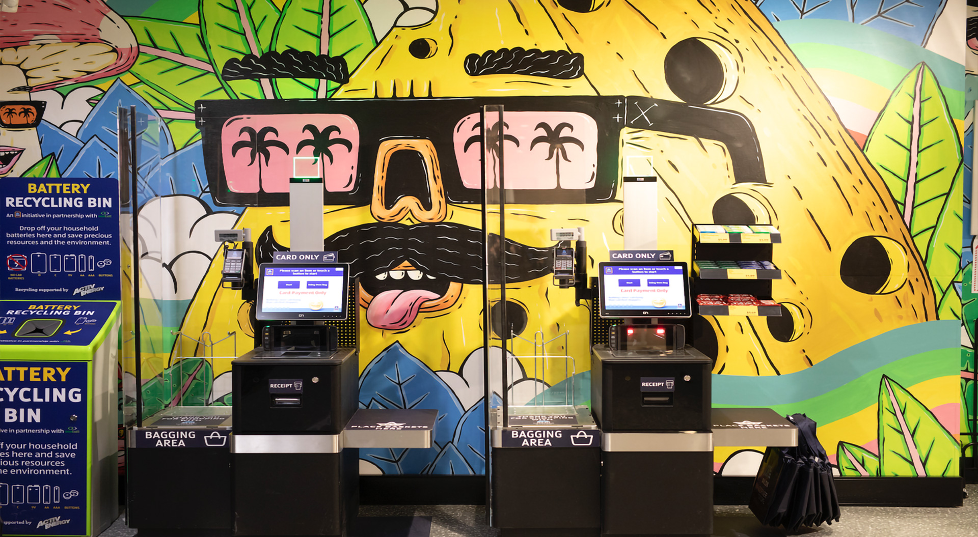
Supermarket brand identity has evolved far beyond logos, colour palettes, and packaging—it has become a fully immersive spatial experience. As consumer expectations continue to shift, leading retailers are harnessing the power of store design to strengthen brand connection, enhance loyalty, and deliver more meaningful shopping journeys. Through the thoughtful integration of brand colours, storytelling panels, and local identity, supermarkets are transforming their spaces into emotionally resonant environments.
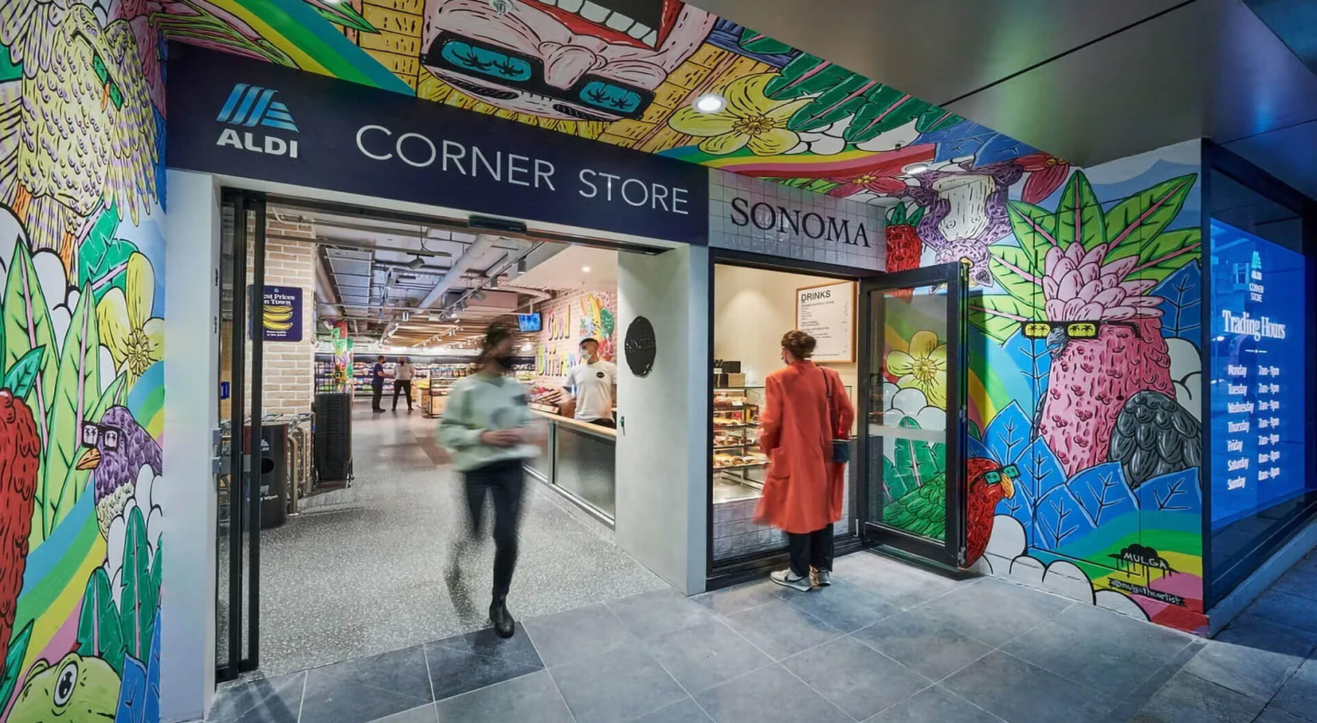
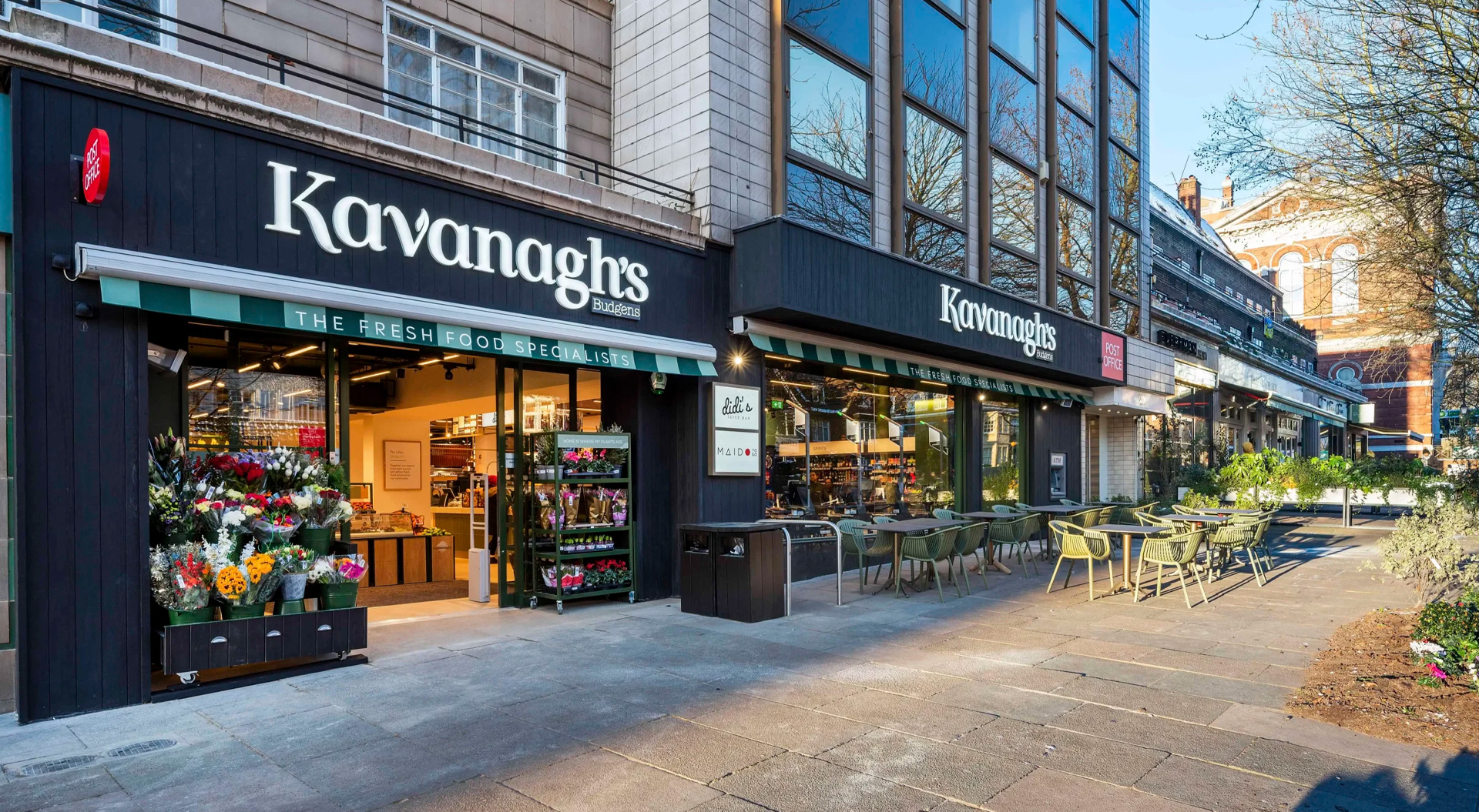
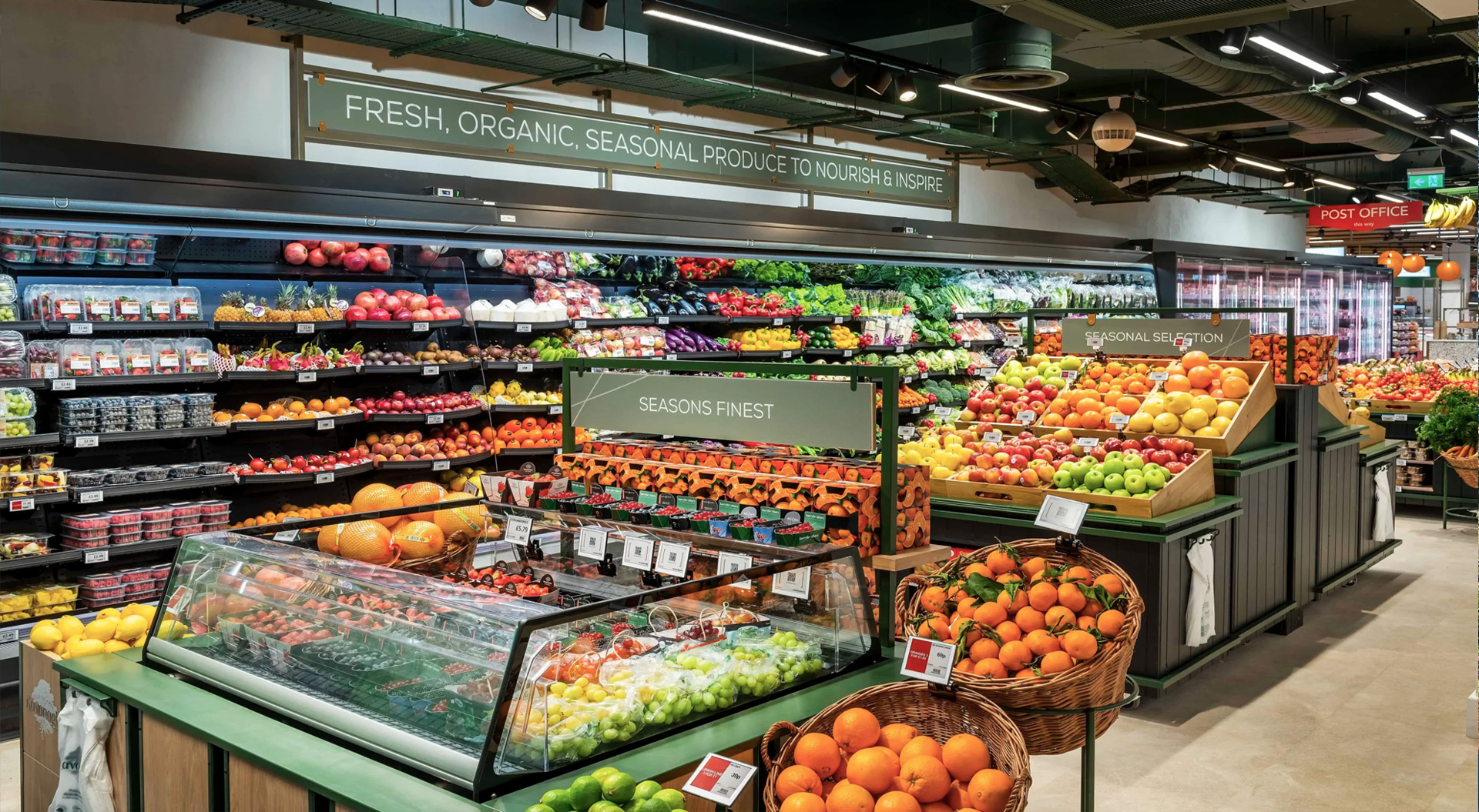
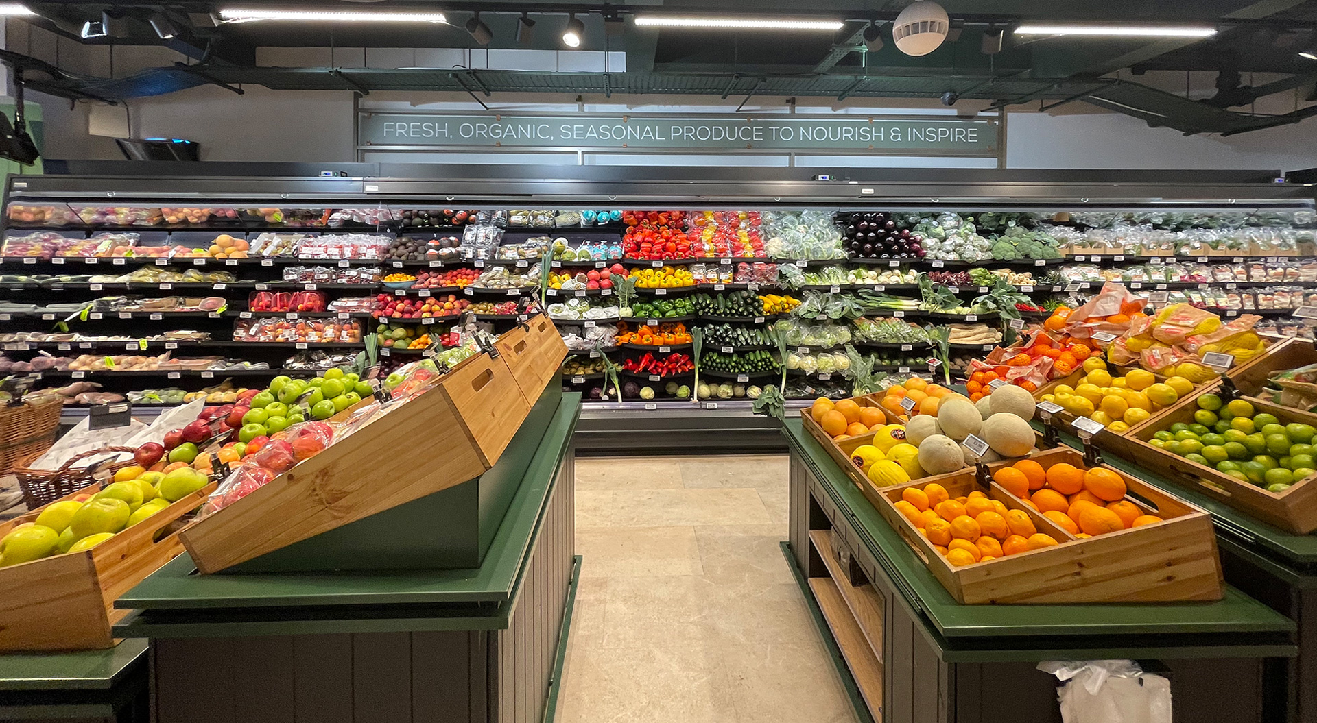
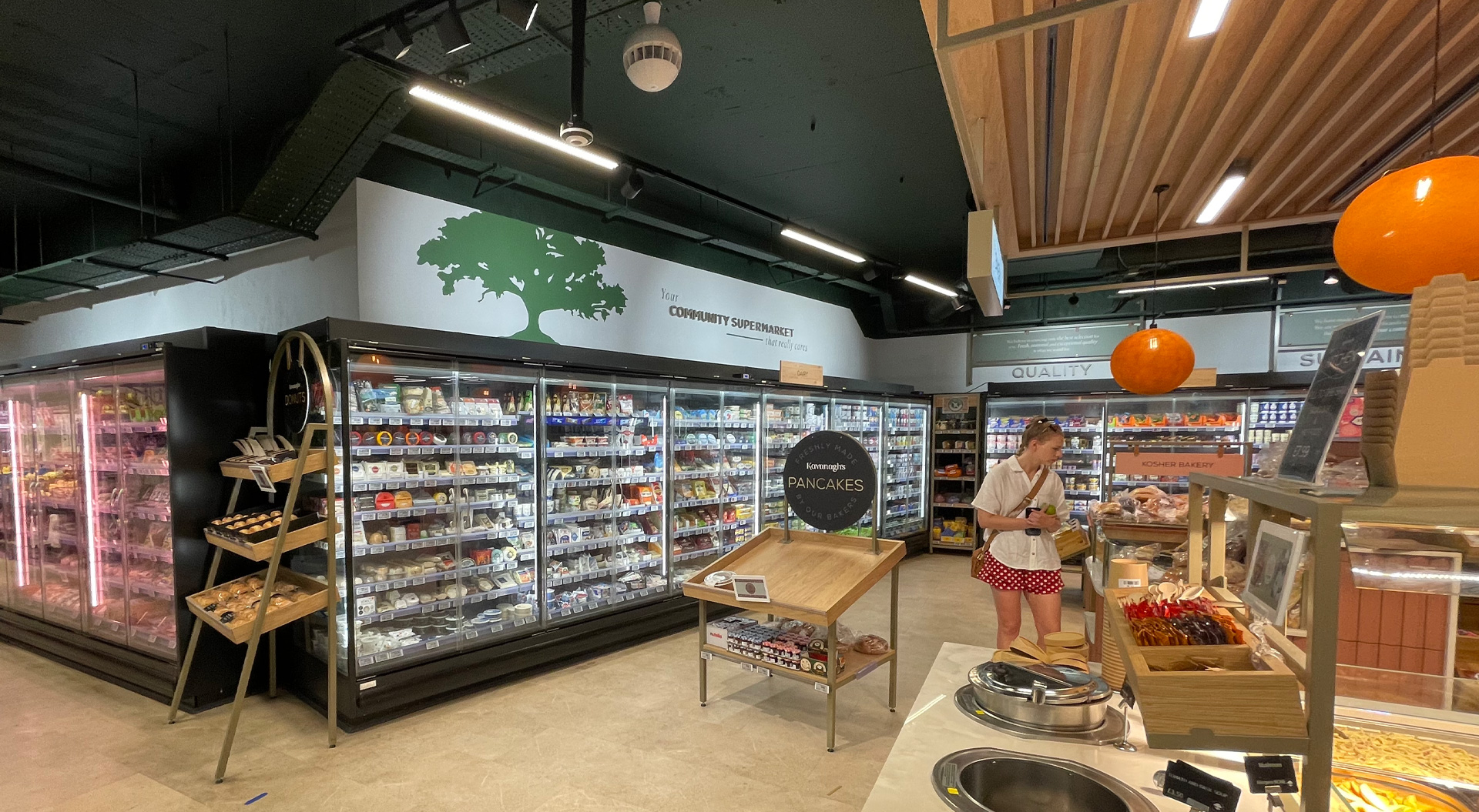
In this article, we explore two contrasting approaches to supermarket brand identity through store design: Aldi’s urban-focused Corner Store concept in Melbourne and Sydney, and Kavanagh’s hyper-local neighbourhood store in London.
At Campbell Rigg, we specialise in translating brand strategy into physical space. Our design work for major international retailers—such as Tesco UK, Migros Turkey, Kesko Finland, and Interspar Austria - demonstrates how well-executed spatial branding can elevate customer loyalty, increase dwell time, and distinguish supermarkets in increasingly competitive marketplaces.
Brand Colours as Strategic Emotional Signifiers
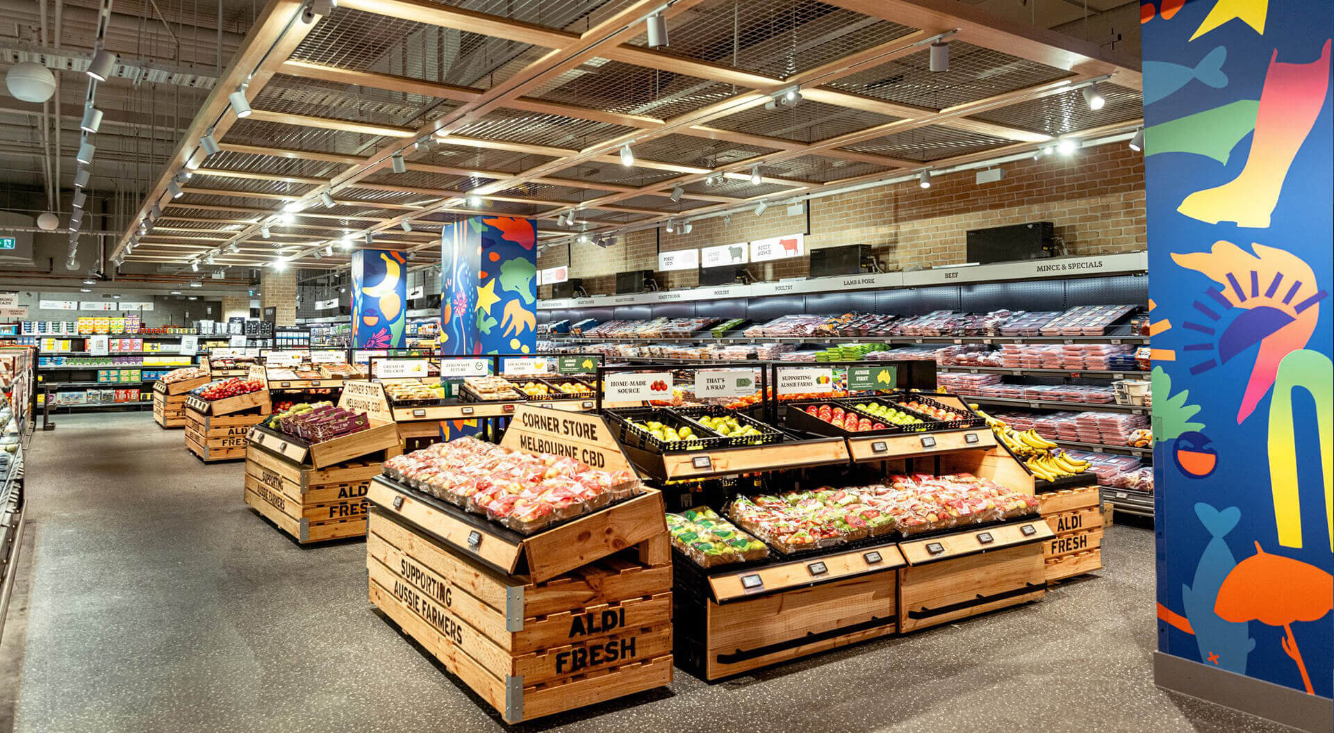
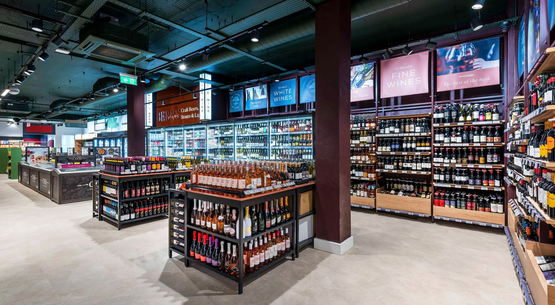
Today’s supermarket interiors go beyond aesthetic appeal—brand colours are employed as emotional and psychological anchors. At Campbell Rigg, we carefully apply signature hues across walls, fixtures, ceiling treatments, and wayfinding to generate instant recognition and create a cohesive journey. For instance, warm tones can evoke hospitality and familiarity, while greens and blues are increasingly used to communicate health, freshness, and environmental values.
Using dynamic lighting strategies—such as LED systems that shift to reflect time of day or seasonal campaigns—we help brands create immersive atmospheres that evolve, keeping the store environment dynamic and mood-enhancing. This level of intentionality reinforces brand values in ways that signage alone cannot.
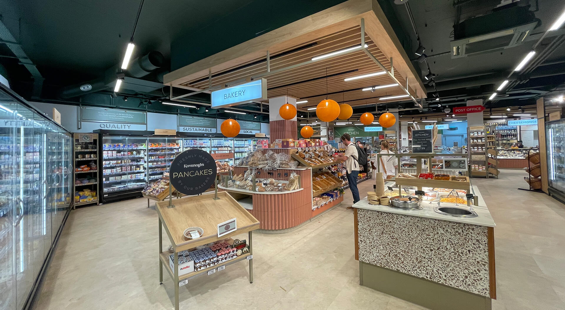
Storytelling Panels that Build Brand Connection
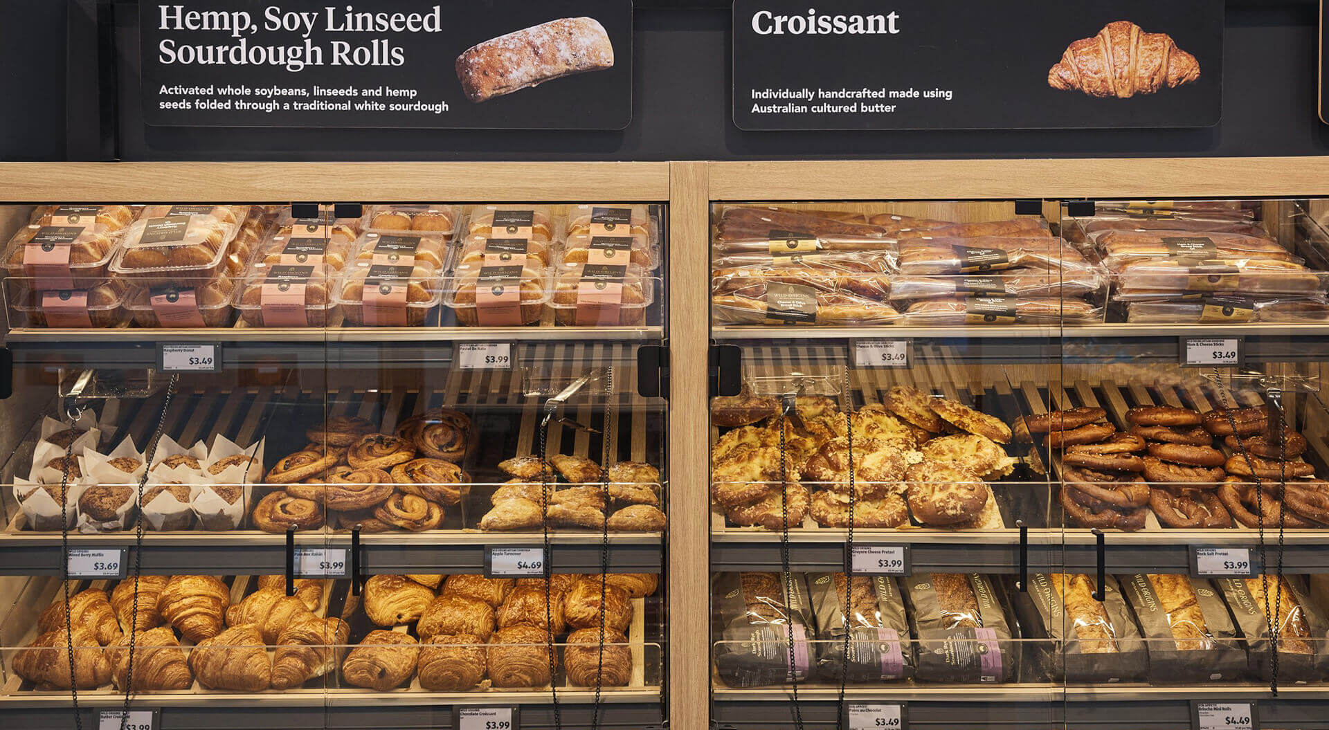
In-store storytelling is no longer a ‘nice to have’—it’s essential to building emotional engagement. Our work integrates large-scale graphics, narrative signage, and interactive digital displays to convey brand ethos, product origin stories, and sustainability credentials. Whether highlighting local producers in Migros or showcasing British farming in Tesco, these panels do more than inform; they invite customers into the brand narrative.
Storytelling strategies can include touchscreen kiosks, augmented reality experiences, and mobile integrations that allow users to scan, learn, and connect on demand. These elements encourage discovery and deepen customer loyalty by making brand values tangible.
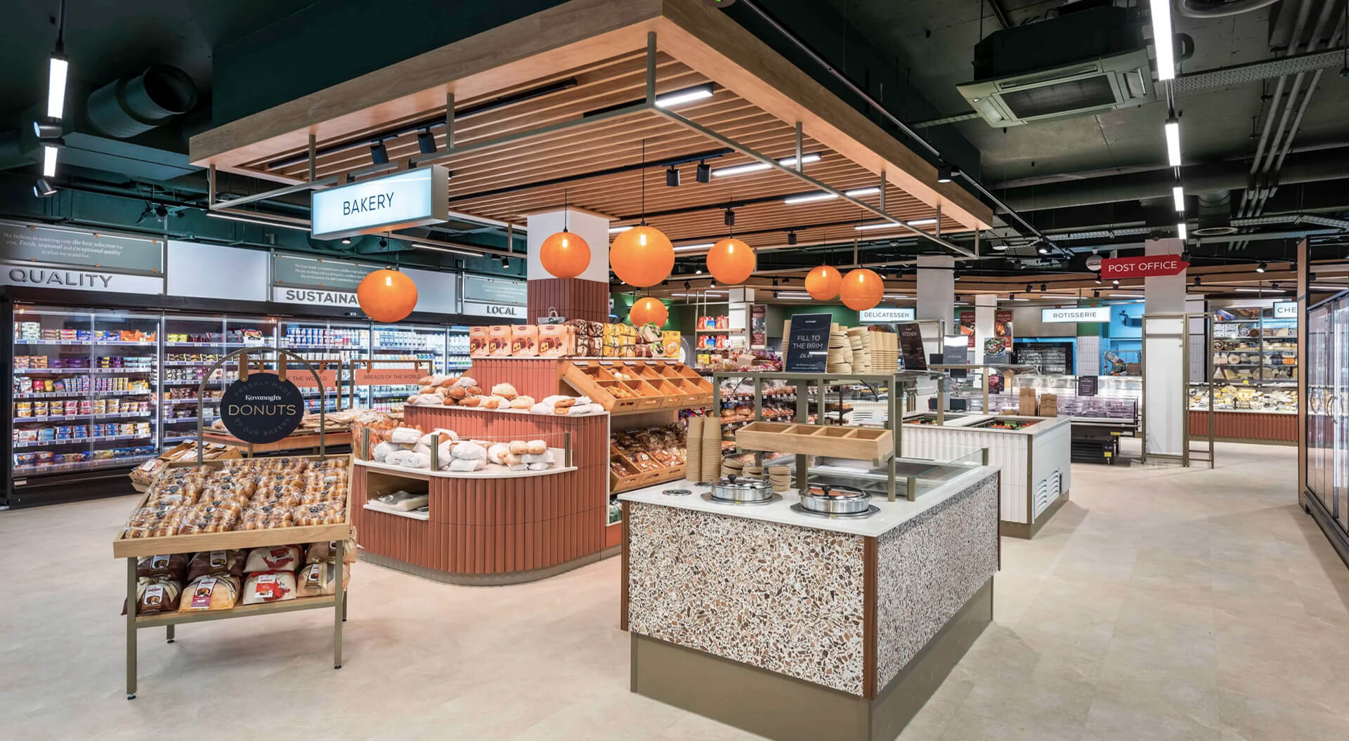
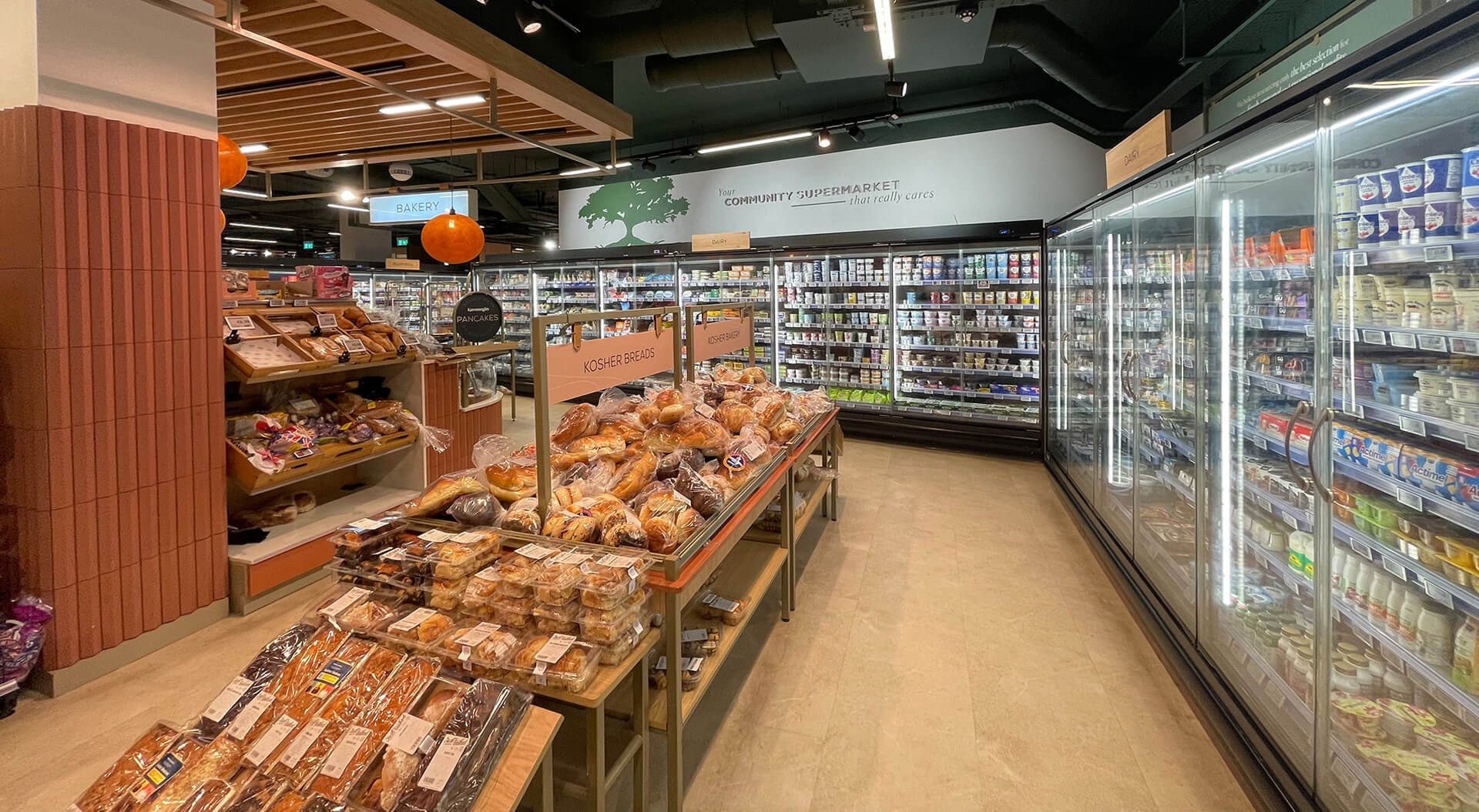
Embedding Local Identity in Store Design
Consumers increasingly favour brands that reflect their communities. In our projects for Kesko and Interspar, we incorporated regionally sourced materials, custom artwork, and architectural elements inspired by local culture. These subtle but powerful design gestures help stores establish authenticity and position themselves as integral parts of the community.
From hand-painted murals and woodwork crafted by local artisans to locally inspired product zones and seasonal displays, the integration of local identity gives supermarkets a cultural richness and relatability that fosters emotional attachment and loyalty.
A Holistic and Integrated Brand Experience
The key to effective supermarket design is integration. Rather than layering disparate elements, our approach at Campbell Rigg is to develop holistic spatial narratives where colour, storytelling, and locality function as a single branded language. This creates environments where every touchpoint—from entry to checkout—reinforces the supermarket’s unique personality and values.
Our end-to-end services include brand strategy, customer journey mapping, concept design, modular fixture development, and implementation guidance. With decades of experience delivering award-winning concepts across Europe, the Middle East, and Asia, Campbell Rigg is uniquely positioned to help supermarkets evolve their environments into brand experiences that feel immersive, efficient, and culturally resonant.
Supermarkets Leading the Way
Many leading retailers are already embracing this design philosophy. Whole Foods Market, Trader Joe’s, Waitrose, Edeka, and Carrefour use storytelling panels, local culture cues, and cohesive brand palettes to shape powerful store narratives. Aldi, Lidl, and H-E-B continue to innovate in compact and large formats alike with evolving strategies for local identity and digital storytelling.
At Campbell Rigg, we see store design not just as space planning—but as a strategic opportunity to bring brand purpose to life. As supermarkets transition from transactional spaces to emotional destinations, design has never mattered more.
Whole Foods Market (USA)
Uses natural materials, earthy brand colours, and in-store storytelling about sustainable sourcing and local producers.
Prominent storytelling panels showcase product origins and community initiatives.
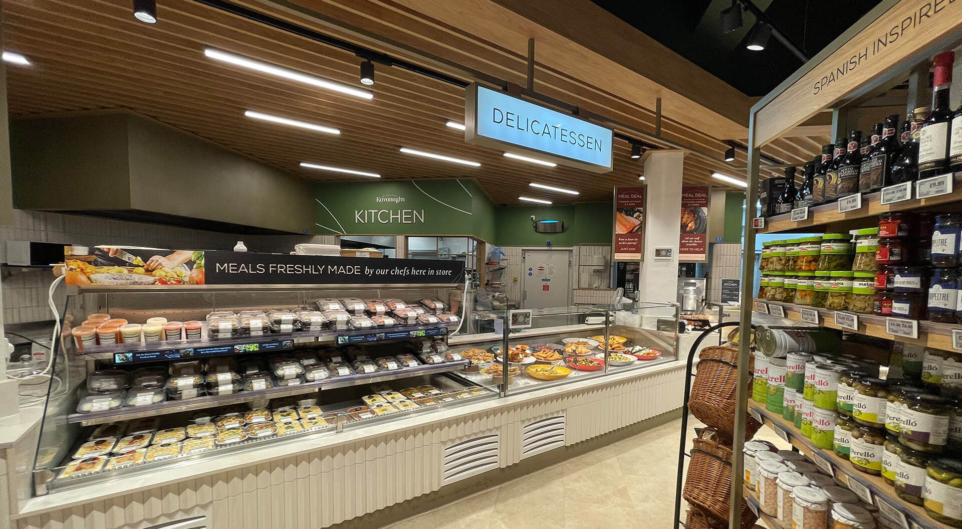
Waitrose (UK)
Incorporates signature green brand colours and elegant, clean design. Uses storytelling to highlight British suppliers and seasonal products, with local touches in different store locations.
Trader Joe’s (USA)
Vibrant, consistent use of brand colours throughout. Fun, hand-drawn signage tells stories about products and local sourcing. Stores feature localised elements and community-focused displays.
Edeka (Germany)
Strong use of brand colours combined with regional design elements tailored for local markets. In-store storytelling highlights local farmers and traditional German products.
Lidl (Various countries)
Modernised stores with clear brand colour schemes and digital storytelling panels. Regional product zones emphasise local specialties and produce.
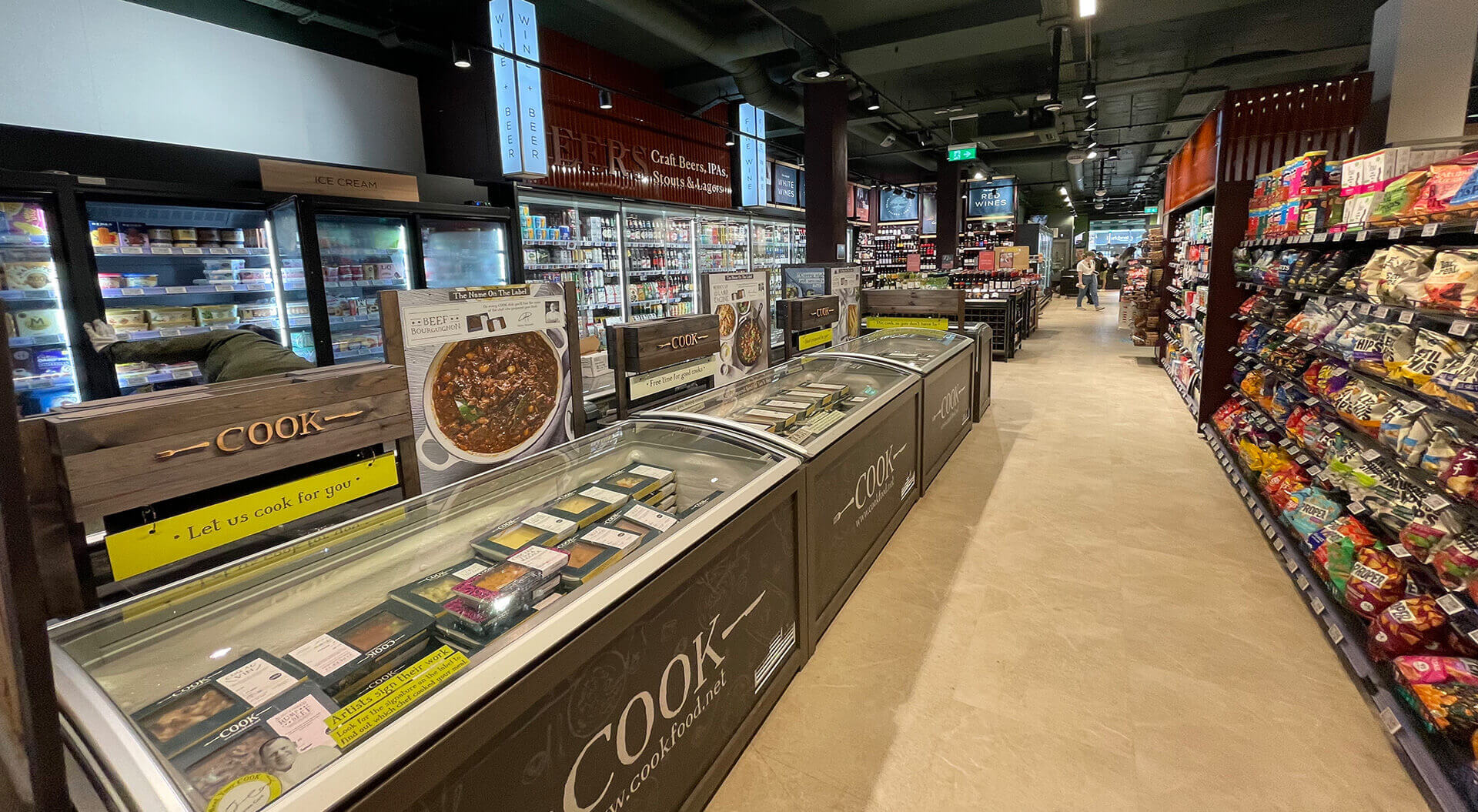
Aldi (Global)
Utilises simple, clean brand colours and layouts.