Gazprom Neft Gas Station Retail Design & Branding
We build forecourt brands designed to transform markets.
Visionary. Innovation. Profitability.
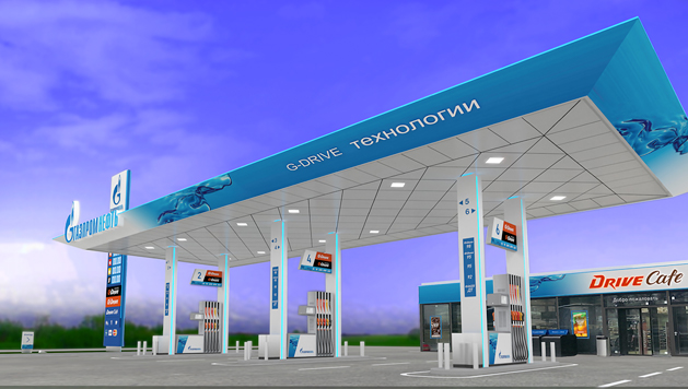
A rebranding concept for Russia’s leading petrol filling station, featuring innovative canopy architecture, graphic communications, and branding.
CampbellRigg partnered with Gazprom Neft, a leading integrated oil company in Russia, to deliver a comprehensive petrol forecourt retail re-branding of the petrol station format, convenience store design and customer experience transformation. The project strengthened brand identity, enhanced forecourt usability and improved commercial performance across retail formats at service stations.
Gazprom Neft wanted to be seen as a confident brand, a challenger to its larger rival Rosneft and
reflect a shift to a modern, "cleaner
fuel" retail operation.The design solution provides a contemporary vision for the
brand platform and retail operation.
Location - Moscow, Russia.
Our focus was to reposition Gazprom Neft’s forecourts as modern retail destinations, spaces that deliver efficient fuelling, intuitive customer journeys and compelling convenience retail environments.
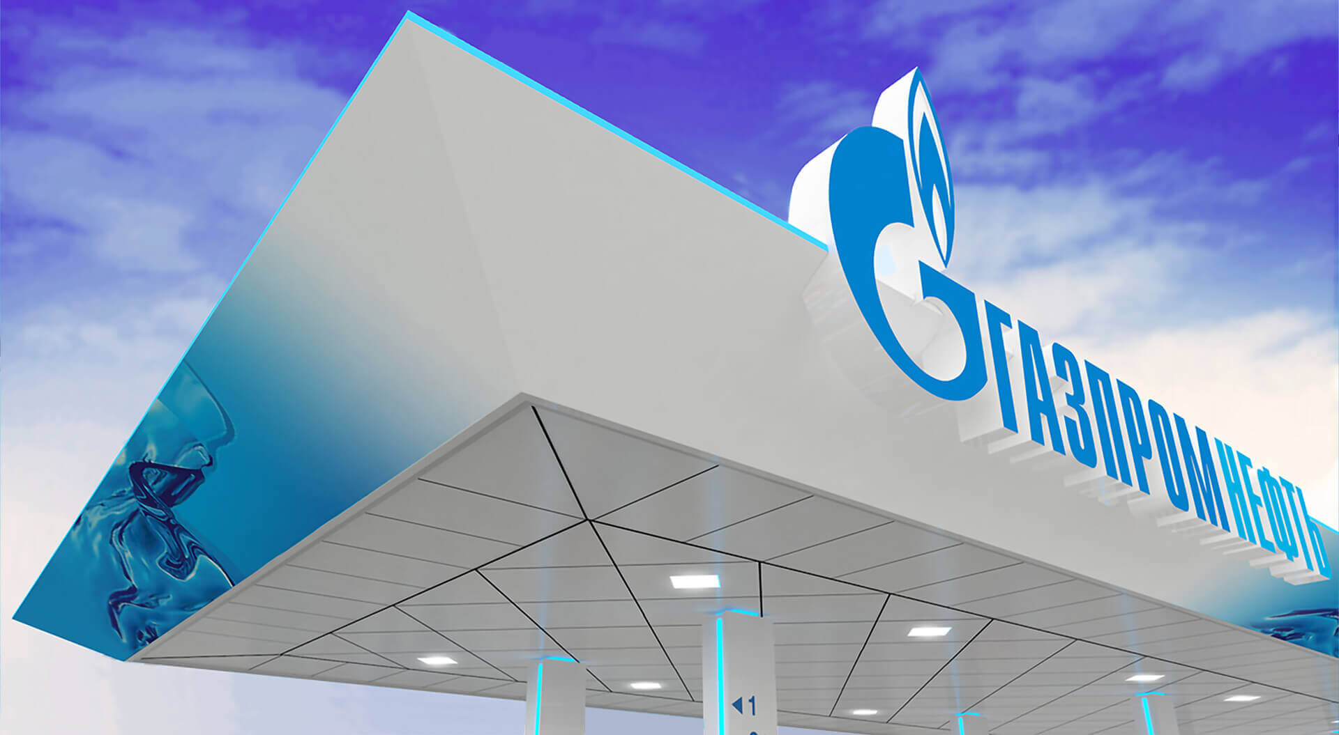
The client’s marketing team challenged our creatives to develop a modern, instantly recognizable canopy design and branding solution for their petrol forecourts. The aim was to integrate advanced fuel retail trends, moving beyond traditional solid structures to high-tech designs that respond to both market competition and evolving customer expectations.
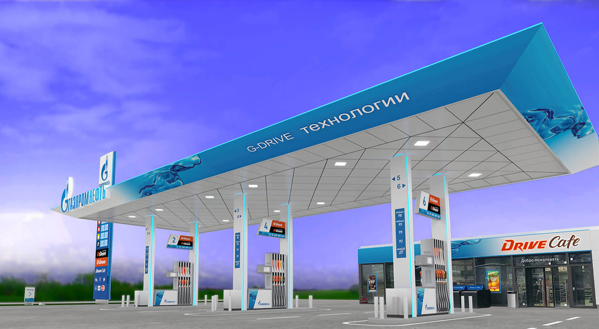
To stand out in a competitive fuel retail market and drive value beyond fuel sales, Gazprom Neft needed a retail design strategy that ensured brand clarity, operational consistency, and seamless, customer-focused experiences across its forecourt network.
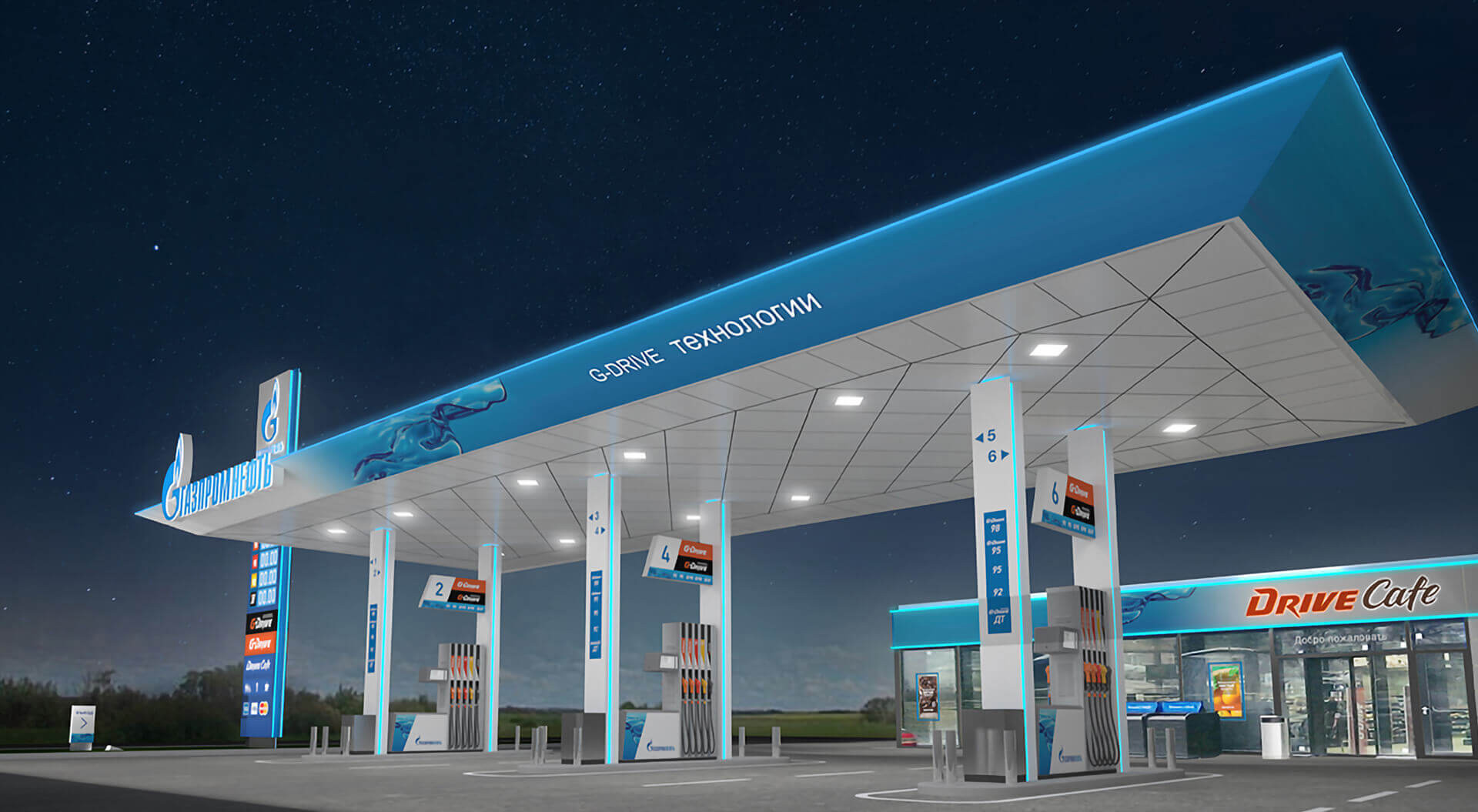
The canopy design captures the harmony of services, reliability, trust, and customer care, infused with energy and movement. Its fluid shapes and layered forms illustrate the seamless integration of products and services.
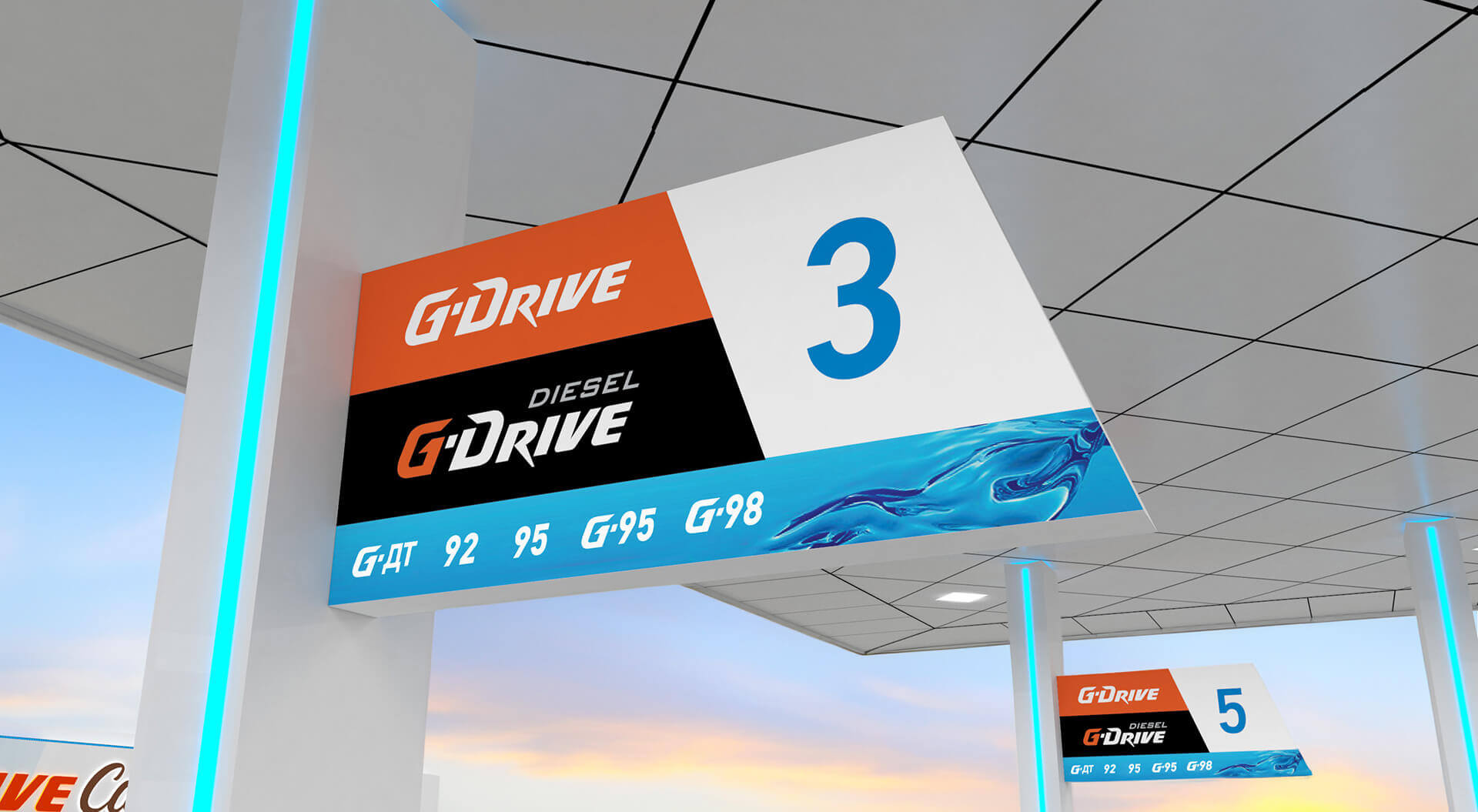
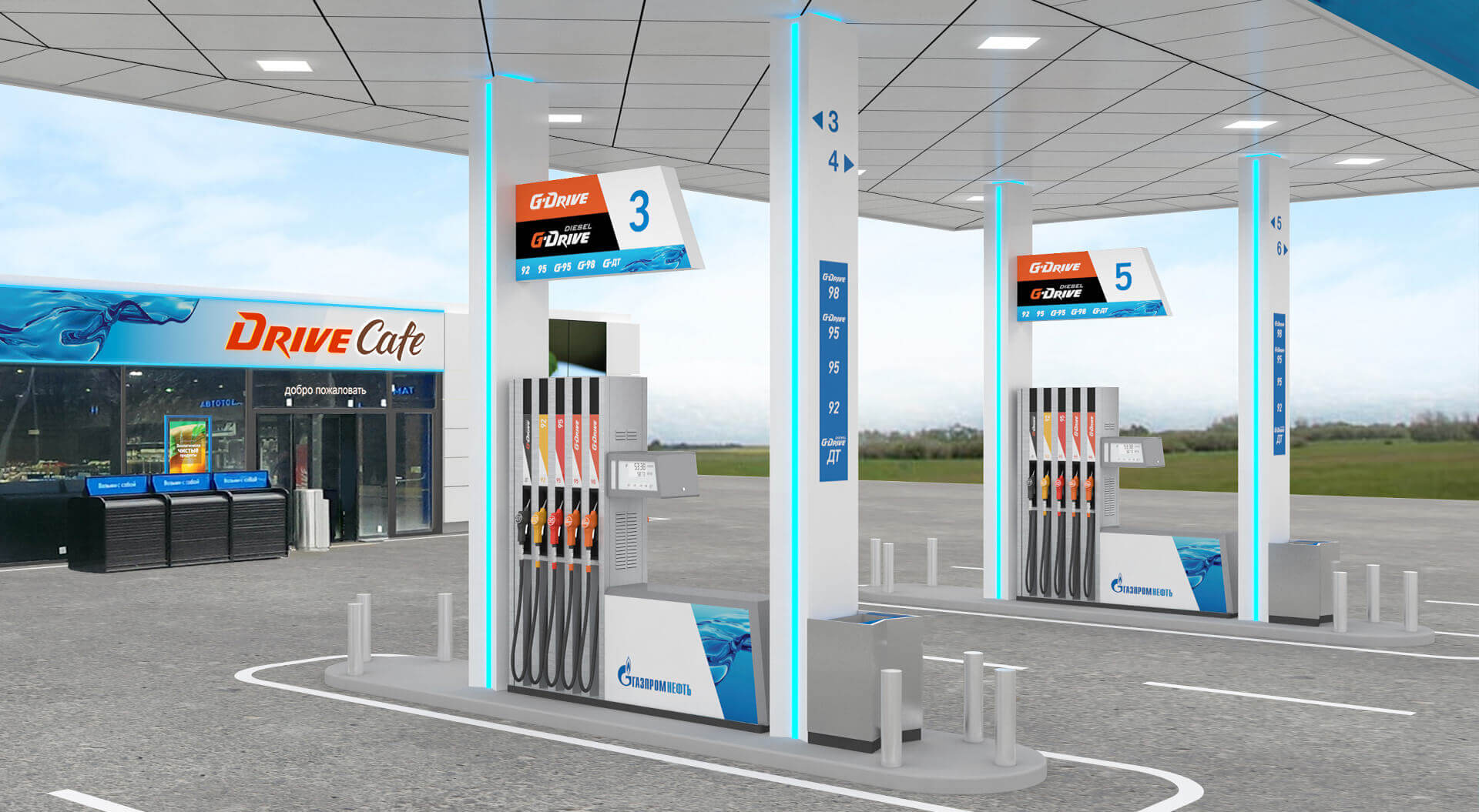
Impact & Commercial Value
Our solutions enabled Gazprom Neft to:
• Strengthen brand perception and retail coherence
• Increase shopper engagement and dwell time
• Improve product visibility and convenience store sales
• Support overall commercial performance with enhanced customer experiences
The result is a petrol forecourt retail environment that aligns with modern customer expectations and supports sustained business growth.
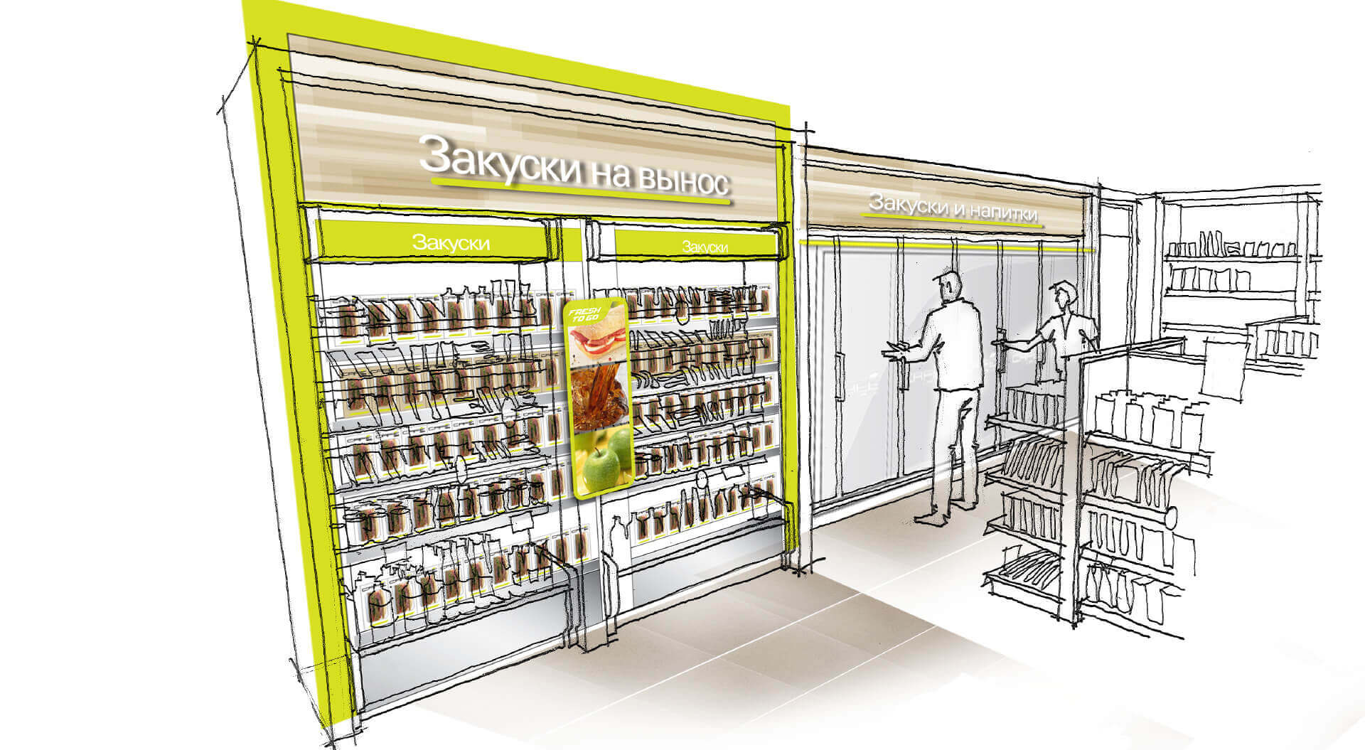
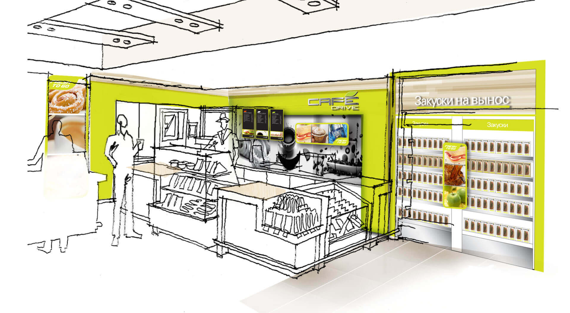
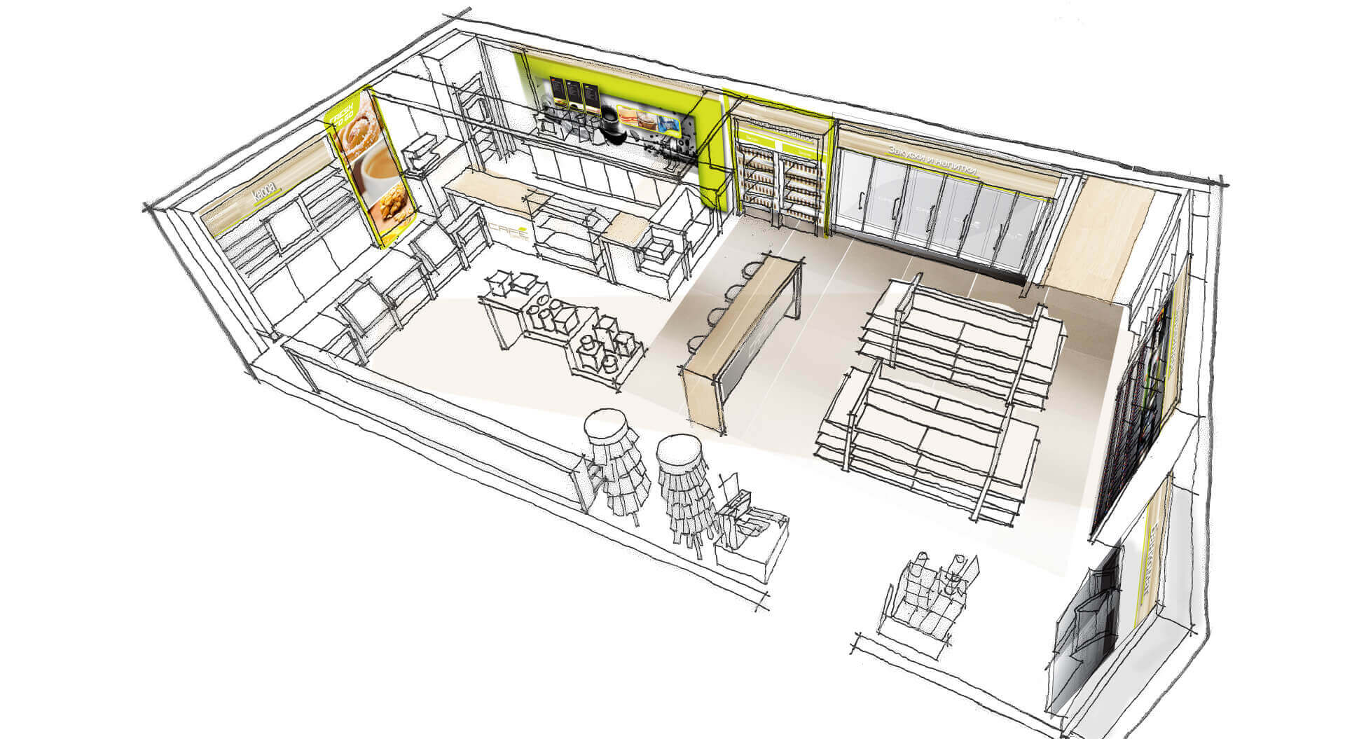
Above & Below: Conceptual sketches of the Convenience Store interior design and branding.
Our Proven Process:
1. Consultation - Free strategic call to assess goals
2. Bespoke Briefing - Co-create a tailored plan
3. Fast Execution - Deliver creative work efficiently
4. Commercial Growth - See uplift in sales, loyalty, and brand performance
Partner with CampbellRigg to Transform Your Store.
Book a complimentary consultation with CampbellRigg’s retail branding and design specialists and unlock more value from every square metre.
Smart Value, Outstanding Quality:
Our fees are structured to be competitive while delivering exceptional impact, creativity and design excellence.
Fast, Focused Delivery:
From strategy through rollout, our agile team works efficiently to deliver high-quality outcomes on schedule.
Cross-Disciplinary Expertise:
Brand strategists, architects, interior designers and graphic designers collaborate seamlessly to shape cohesive, end-to-end retail brand environments.
International Perspective, Local Relevance:
We combine global project experience across Europe, the Middle East and Asia with deep sensitivity to local market dynamics.
Flexible, Scalable Implementation:
From flagship to urban petrol forecourt design and convenience store branding we deliver projects of every scale with precision and efficiency.
Results That Speak:
We transform store networks from transactional spaces into engaging brand destinations that strengthen relationships, enrich experiences and drive measurable commercial growth.
Integrated Creative Partnership:
From brand repositioning and campaigns to spatial design and rollout, we offer a fully integrated service aligned to your commercial ambitions.


