Tesco Supermarket Multi-Format Re-Branding Trends
We build effective brand identity strategies and environments.
Innovative. Creative. Experiences.
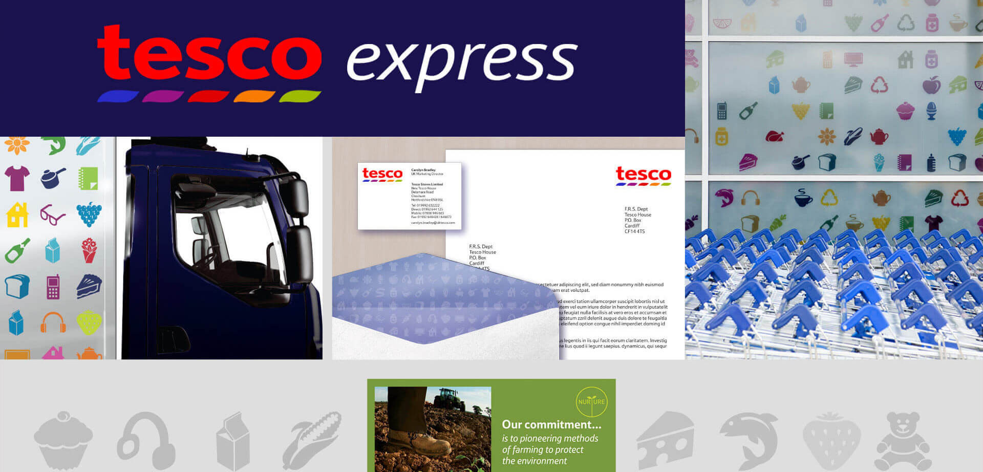
Creating a cohesive brand identity, effective marketing, and branding strategies. Includes POS communications and own-label packaging design for a global food retailer.
Tesco Food Retail Brand Strategy & Identity Refresh.
At CampbellRigg, we specialise in developing cohesive food retail brand identities that bring shopper value propositions to life. We strategically align visual design, packaging, and in-store expression to strengthen brand equity and commercial performance. Our work for Tesco demonstrates how a global food retailer can refresh its brand platform across formats and touchpoints to create a more human, approachable, and consistent brand experience.
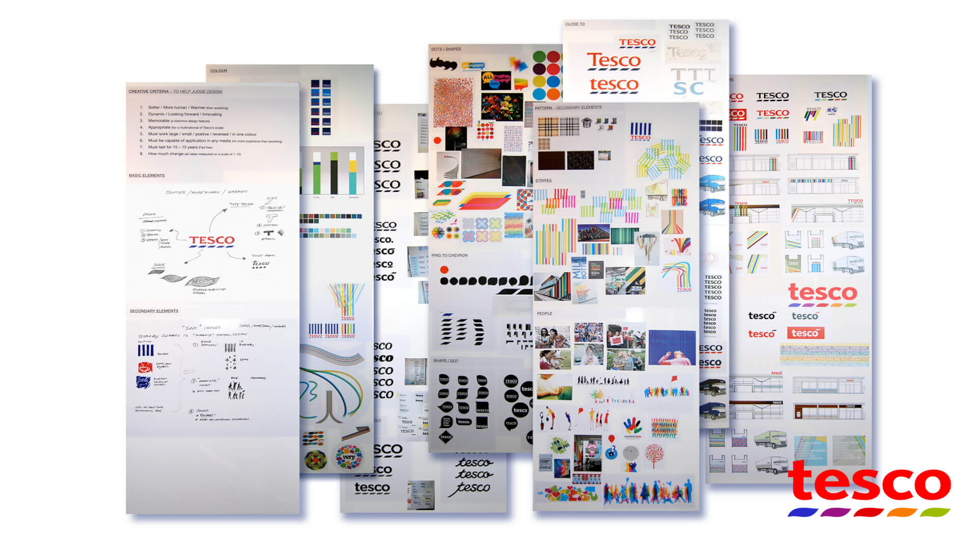
For Tesco, the objective was to evolve the core brand identity into a contemporary and warmer expression that resonates emotionally with customers while reinforcing the retailer’s promise of quality, value, and convenience. This included defining clear brand expressions, refining the logo and visual system, and establishing creative criteria for above-the-line and below-the-line communications, including own-label packaging, point-of-sale materials, and retail environments.
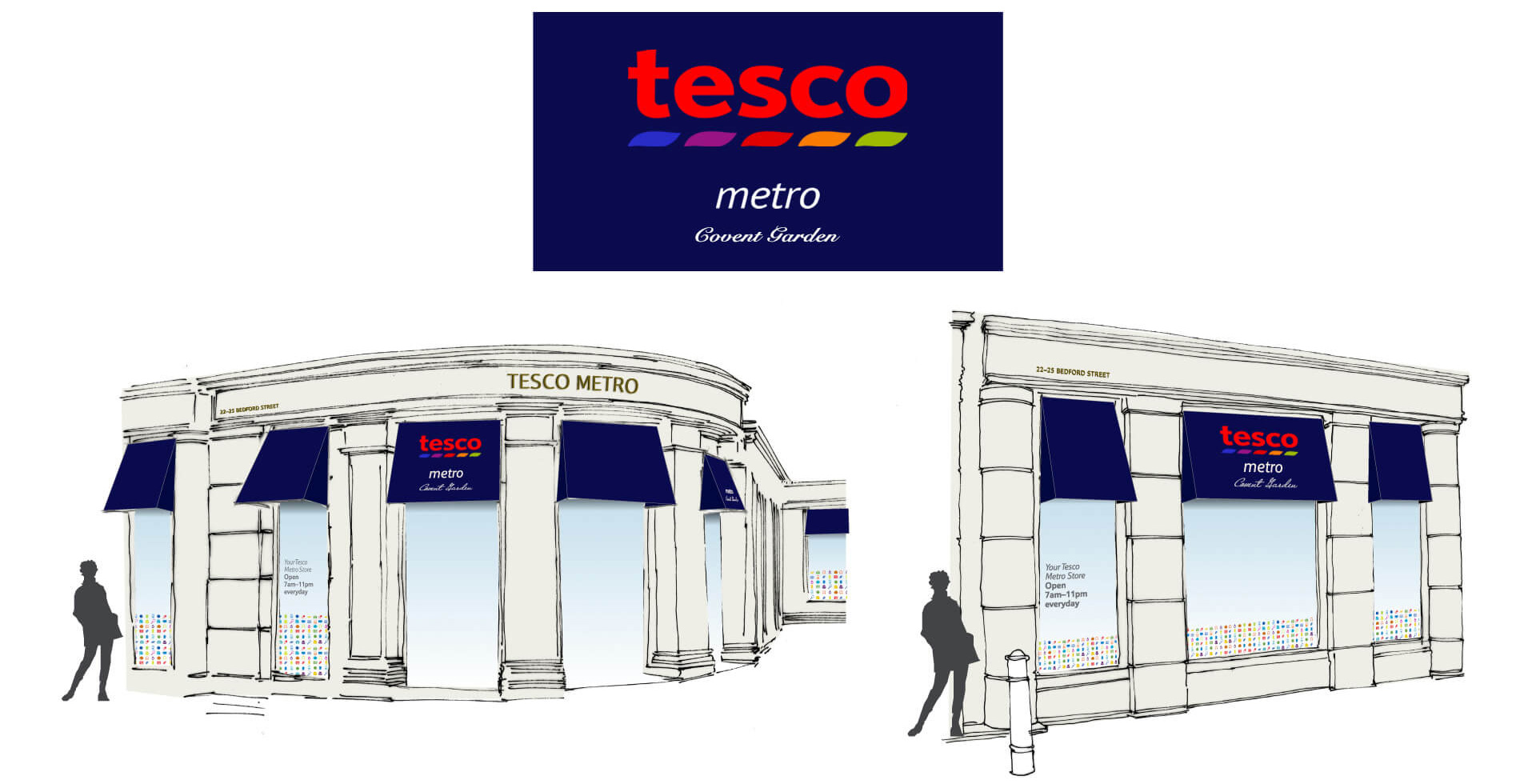
Tesco brand identity refresh, own-label packaging, and brand-building marketing communications.
Tesco’s marketing team wanted a contemporary logo that would soften, humanise, and warm the brand, and demonstrate how it could be applied consistently across all communication channels.
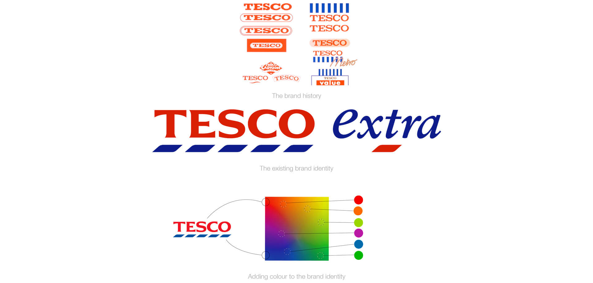
Client Challenge: Brand Coherence & Shopper Connection.
Tesco’s marketing leadership wanted to soften and humanise the brand’s presence in-store, on packaging, and in communications to better reflect brand values and increase shopper relevance. The challenge was to maintain a consistent global identity while allowing flexibility for local market execution and multiple store formats, from convenience stores to hypermarkets.
Strategic Approach: From Identity to Experience:
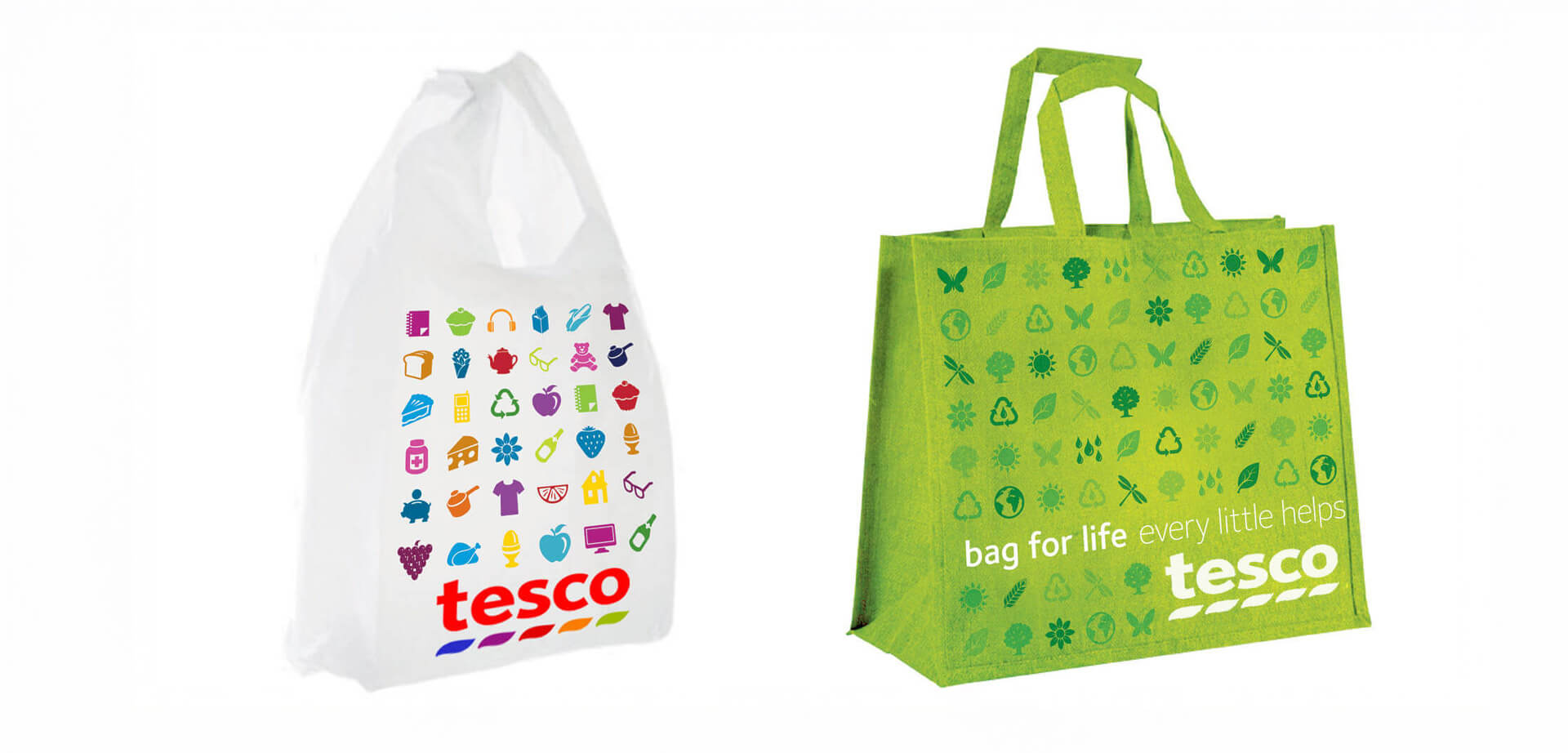
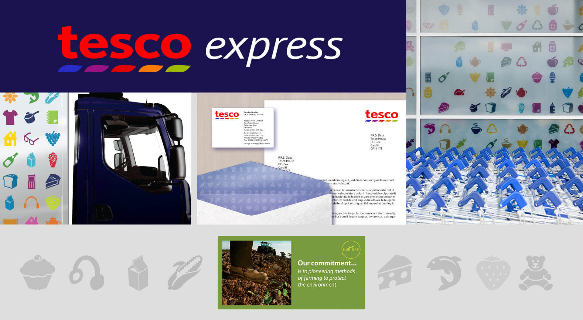
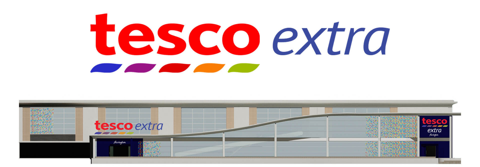
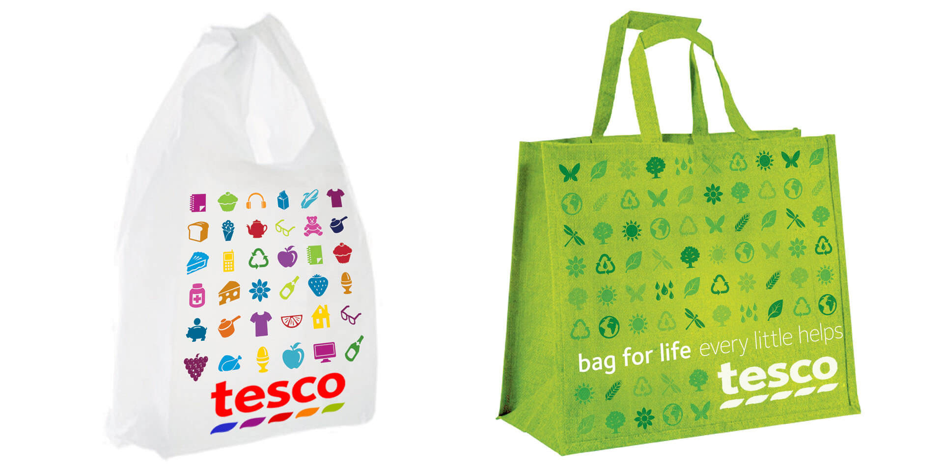
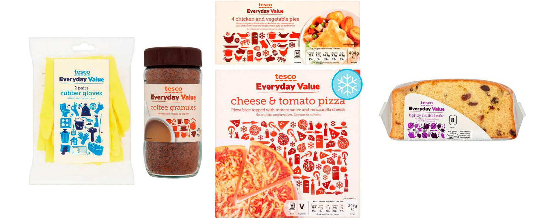
Our strategic process began with a detailed articulation of Tesco’s brand values and shopper expectations. We developed a refreshed visual identity system featuring a modernised logo, typography, and flexible graphic assets tailored to diverse retail contexts. This system was extended to own-label packaging and brand communications to ensure consistency and recognisability across all touchpoints.
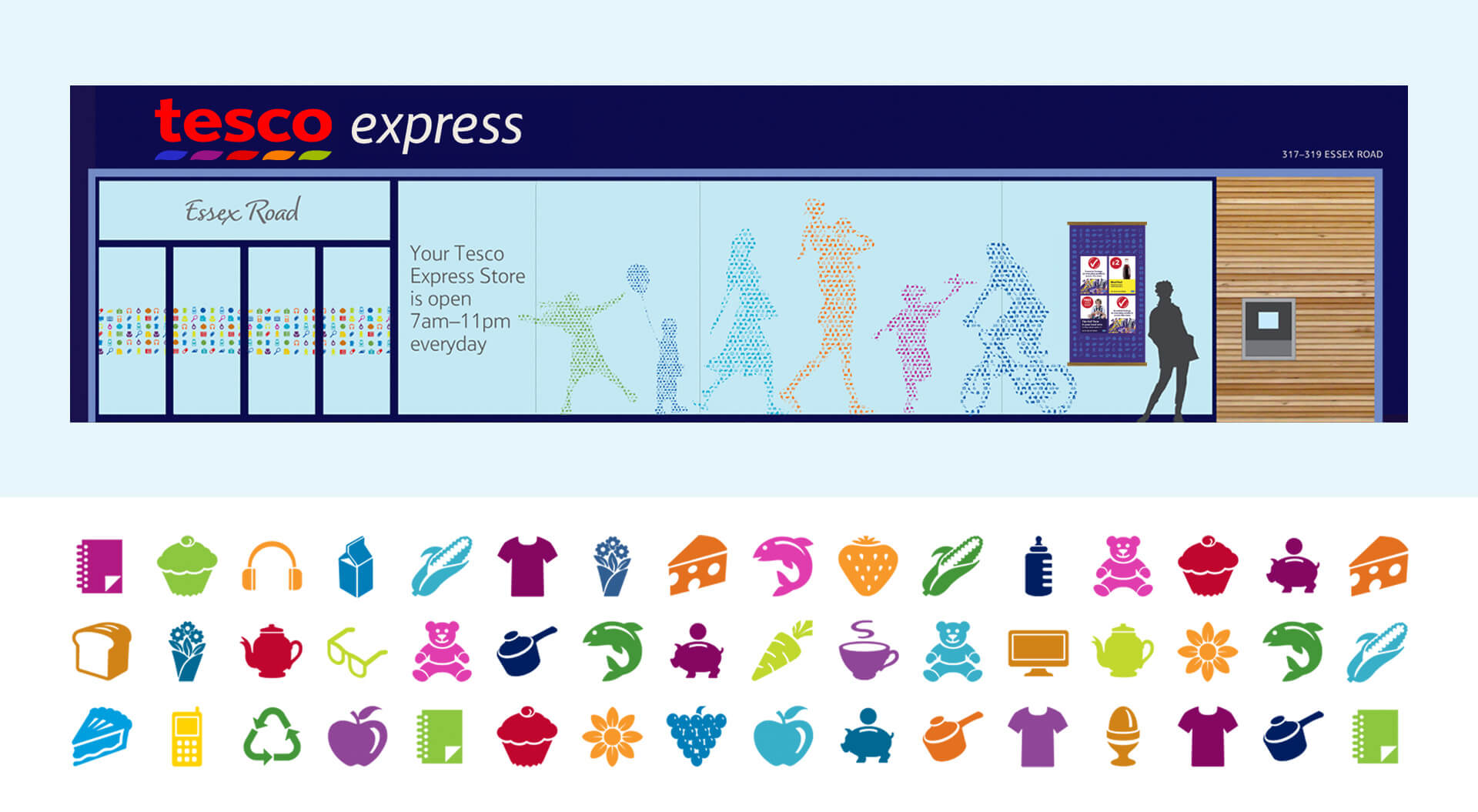
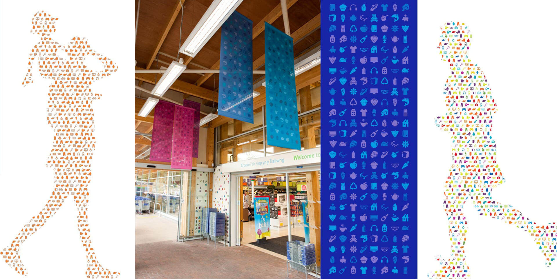
In parallel, we developed a coherent in-store “look and feel” that softens the brand’s visual presence, enhances the customer experience, and integrates community and environmental initiatives into the retail environment. Applying the identity across entrances, signage, promotions, and packaging strengthened brand cohesion and shopper trust.
Commercial Value & Shopper Impact:
The refreshed brand identity delivers a more approachable and emotionally engaging presence that aligns with customer expectations for quality and value, key drivers of loyalty and repeat purchase in competitive food retail. By integrating brand strategy with customer experience design, Tesco’s refreshed food retail brand ensures visual consistency, stronger brand recall, and improved overall shopper engagement.
Our Four-Step Process:
1. Book a free consultation
2. Co-create a bespoke brief
3. We execute the creative work quickly
4. You see sales, brand loyalty, and market share growth

Ready to Transform Your Supermarket Performance?
Schedule a free consultation with CampbellRigg’s retail branding and design experts to make every square metre work harder.
Cost-Effective Excellence:
Our pricing structure is highly competitive, offering exceptional value without compromising on quality or creativity.
Rapid Execution:
We move fast. From concept to implementation, our agile team ensures your project is delivered on time and to the highest standards.
Multidisciplinary Expertise:
Our team brings together experienced brand strategists, architects, interior designers, and graphic designers to create seamless, end-to-end brand environments.
Global Reach, Local Insight:
With successful projects delivered across Europe, the Middle East, and Asia, we combine international experience with local market understanding.
Scalable Project Delivery:
Whether a flagship hypermarket, metropolitan supermarket, or convenience store, we manage and execute projects of all sizes efficiently and effectively.
Proven Track Record:
Our designs evolve branch networks from purely transactional spaces into experiential, relationship-focused brand environments, enhancing engagement, elevating customer experience, and driving measurable business results.
Full-Service Creative Agency:
From rebranding and marketing campaigns to spatial design and rollout, we provide integrated services tailored to your goals.


